
Ege Özgün (PHYS/PhD)
ozgun@fen.bilkent.edu.tr
Last time I talked about the art of covering. This week, I want to change the order of the words and talk about cover art. Actually, I should be more specific about it and say “album cover art.” Covers have such great power that sometimes they can be the driving force behind the sale of a record. Vinyl LPs, with their huge size, have the most impressive covers among the recording formats that include their modern competitors, cassettes and CDs. Cassettes usually don’t even display the full cover designed for the LP version of the same recording, and sometimes they have completely different art to fit the typically rectangular (or square in the case of some double cassettes) boxes. Similarly, alternative art for CD releases can also be encountered, but it is not as common as in the case of cassettes. Having given this brief introduction, I would like to list some specific examples of cover art that I really appreciate. I will in general be referring to the CD versions, and so will indicate if I am talking about a different format.
Iron Maiden-Somewhere in Time
The first is the cover of “Somewhere in Time” by Iron Maiden, and with its dozens of references to movies, books and earlier Maiden albums as well as its sci-fi atmosphere, it is in my opinion one of the best covers ever made for an album.
Target-Mission Executed
The 1987 album “Mission Executed” by the Belgian speed/thrash metal band Target has a dystopic cover, a type of art that is quite common in the genre and depicts their worries about the future, technology and politics.
Jethro Tull-Thick as a Brick
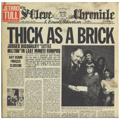 This one is very special for me because the album itself is among my all-time favorites, probably at the top of the list. The design features the cover page of a fictional newspaper— which actually is a parody of a small-town English newspaper—and the headline talks about the disqualification of an eight-year-old boy, “little Milton,” and his poem “Thick as a Brick” from a poetry contest due to its offensive nature. The poem itself was written by Tull frontman Ian Anderson, and it shows he is not only a very talented musician but also a great poet. The original LP version is in the form of a 12-page newspaper and contains many parodies. So to enjoy the full beauty of the design, one should check out the LP cover.
Bill Frisell with Dave Holland and Elvin Jones-Self-Titled
I bought this record years ago just because of its album cover. I have a theory that albums with nice covers are most of the time—if not always—very good albums (whereas the opposite is not true in my opinion, since I also know of a huge number of nice albums with grotesque and ugly covers). This album, by the jazz trio of Bill Frisell, Dave Holland and Elvin Jones, supports my theory.
Evildead-Annihilation of Civilization
Again, a thrash metal cover that offers a sarcastic critique of a nuclear future. Here I want to note that I think the most creative album covers belong to thrash metal and its sub-genres.
Opeth-Morningrise
My favorite album from Opeth and also among my all-time favorites: here comes Morningrise! The cover features a photograph (slightly edited, as far as I know) of a lake with a reflection of a bridge-like structure. The album itself is a masterpiece, which again supports my theory. Actually this is true for every album in the list.
Pestilence-Testimony of the Ancients
After the departure of Martin van Drunen, Dutch band Pestilence released their third album, “Testimony of the Ancients.” Although I like all of the records made by Pestilence prior to their disbanding (Patrick Mameli reformed the band in 2008, and then they released three more albums, which are below par in my opinion), this one is my favorite. Coming back to cover art, this example gives the feeling of an ancient medieval dungeon, with a corridor illuminated by torches, and barred windows and some chains.
Voivod-Killing Technology
 “Killing Technology” is one of the very first techno-thrash albums. The cover design was created by their drummer Michel Langevin (nearly all Voivod logos and album covers were done by him). He has a unique style in his designs, with a touch of a cartoonish feel.
Ulver-Shadows of the Sun
Ulver finds a way to appear in my column every time. As a matter of fact, you can find this album cover in my previous column. It is just beautiful.
King Crimson-In the Wake of Poseidon
The cover art for the British prog-rockers’ second album, “In the Wake of Poseidon,” is
a work called “The 12 Archetypes [or The 12 Faces] of Humankind,” painted by Tammo de Jongh in 1967. Needless to say, the album itself is again magnificent.
This was just a collection of albums with great cover art that were the first to come to my mind, and thus it was quite random. My motto here is “An album with nice cover art is always worth listening to.” So my advice is, if you encounter a record with an eye-catching cover, buy it!