SENA KAYASÜ (ARCH/IV)
sena.kayasu@ug.bilkent.edu.tr
Innovation is funny, isn’t it? Sometimes the simplest idea is completely out of reach until someone thinks of it. After that, it becomes obvious.
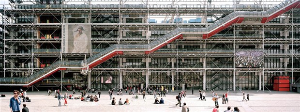
Take the Centre George Pompidou. This museum in Paris turns the idea of a building inside out. It takes what was always hidden—air conditioning, electrical systems, circulation (elevators and escalators), structure—and exhibits it like a work of art. So simple, yet so original.
Of course, there was a reason that architects Richard Rogers and Renzo Piano were able to pioneer this kind of postmodern design. The museum was dedicated to all things avant-garde, so those who commissioned it thought it best that the building itself embody the freedom that the artistic movement advocated. The structure was to be designed in a way that would allow all spaces to be adaptable and all interior walls to be movable. Without the option (or, probably, the desire) for ornamentation or compartmentalization, Piano and Rogers created a building that was simplified down to its core.
Then they colored it. The issue with stripping an edifice is that everything is…gray, for lack of a better word. So they painted plumbing green, air conditioning blue, electrical lines yellow and circulation red. The structure is colored white. All of this was meant to lend the building movement and its critical systems meaning. Pompidou looks like something from a science fiction movie, but with soul and—literally—color.
However, innovation is rarely found unaccompanied by controversy. Parisians did not look kindly on the intrusion of two unknown (as they were before Pompidou) foreign architects into the accustomed texture of their city. Paris is famous for its historic and orderly streets being laid out on a radial grid, with every house and shop subordinate to the famous fabric of the town. They did not like the 100,000 m2 of metal, just as they did not like I. M. Pei’s infamous glass pyramids being added in front of the 18th-century structure of the Louvre in 1989.
What most critics at the time viewed as an infraction of a tradition that was centuries old was, in fact, a small exception to an urban texture that was only a little more than 100 years old at the time. I have already described Napoleon III’s strategic reconstruction of Paris in the 19th century for my regular readers, but those who are interested in reading further may want to look into a character called Baron Haussmann.
It’s worth noting, though, that the Centre Pompidou was a sociopolitical maneuver, just as Haussmann’s intervention into the city was. Believe it or not, Georges Pompidou was the prime minister of France during the student uprisings of 1968 and tasted their aftereffects as the country’s president starting in 1969. He believed that a revolutionary new building that embodied ideas of modernity and flexibility in the midst of a traditionally rigid urban fabric would calm students down. He even made it part of the commission that the museum open onto Place Igor Stravinsky (named for an avant-garde musician, no less) so that the French youth would have a place to calm down. This space is actually a great example of an urban plaza, since it slopes ever so slightly toward the Centre Pompidou. Hence, it acts like an inconspicuous amphitheater for the museum.
This great idea, with the attention that the innovative structure received and the panoramic rooftop complementing the picturesque city, did not stop an old lady from hitting Richard Rogers on the head with her umbrella when she found out he was the architect. But at least he got a story out of it.
Not to mention that he became famous, along with Renzo Piano, for rekindling the debate on what to do with the “intestines” of a building. The intestines are so called because they are often ugly and nasty but absolutely crucial. They are the mechanical and electrical systems, the plumbing, parking and garbage bins. They are what we don’t want to see and smell. So we hide them. Right?
Not necessarily. Piano and Rogers demonstrated that the innards of a building can be thoroughly aesthetic. Theirs was a dramatic example, but the discussion has been ongoing since the “honesty” idea appeared in the 1920s. Honesty in materials (don’t paint over things) is as important as honesty in form (let the interior be in tune with the exterior). Architects like Frank Gehry and Zaha Hadid—may she rest in peace—are once again experimenting with these “rules,” but those experiments are happening at both ends of the spectrum.
I would be lying if I didn’t say, “There’s just some magic in truth and honesty and openness.” But that’s just me.

