SENA KAYASÜ (ARCH/II)
sena.kayasu@ug.bilkent.edu.tr
This past weekend, I had a chance to go on a trip to İstanbul for the second time this semester. When I talked about my first visit, I said that I wanted to see the Anish Kapoor exhibition next time, if at all possible. Well, guess what? I did.
The trip was actually not about art or traveling idly through a weekend that could be better spent… sleeping? or whatever activity appeals to you. It was a field trip organized by my department to go and see the site for our new design project: Florya. I don’t know how many people have heard of Florya; I only knew its name through a comedy film, as the district of İstanbul where the male lead gets shot (“Hırsız Var,” 2005). In fact, it’s a beautiful part of İstanbul that has an actual white sand beach. There’s no structure above three storeys to be seen, and most buildings are old (in a sophisticated sort of way). There are many buildings, yet somehow it appears as if it was untouched by humans. At the very least, it has managed to escape the sense of being in the metropolis that surrounds it. The reason we went there as second-year students is that a modernist architect of the 1930s built a summer house for Atatürk in the Sea of Marmara. Yes, that’s right: in the sea. The structure is balanced on steel piers, and sits meters away from the shore. Once you are on the shore, there are very few other manmade structures on sight; on an autumn day with no one swimming, it’s like a scene from a movie, complete with flocks of seagulls flying in the distance. Highly sculptural, this is one of the most distinguished buildings in Turkey.
Speaking of sculptural, the second highlight of the trip was the visit to the Anish Kapoor exhibition. It was in the Sakıp Sabancı Museum, which is pretty far from everything, despite being in the middle of the city. I’m sure that anyone who has been to Istanbul can guess the reason: traffic. Movement is organized in elaborate lines of traffic jams, which results in walking being faster than driving. Except, the city is so large that it spans two continents; but that’s beside the point.
The point is that the exhibition was amazing. There were more pieces than I had expected, despite them being colossal, and a lot of them were placed in the garden. We could see them even as we were climbing the hill approaching the building. Most of the pieces were made out of stone or stainless steel.
The steel pieces were all polished to the point where they acted like mirrors. Most of these works were placed outside. Through them, Kapoor seems to be experimenting with the idea of seeing yourself and your environment in different ways. Even though the surfaces are all reflective, they are also bent, so that the image that you see is never the real one. Generally, on the surfaces, you see people, either upside down or really thin. Of course, this is not to say that they are like funhouse mirrors, which are made so that people can be amused by seeing themselves in funky ways. These pieces have amazing forms and have been created to question perception through the varying shapes to be seen in them. They caused me to think that there is not only one way to view reality. For example, right in front of the entrance, there was a piece that had the form of an incomplete cylinder. When you look at the concave interior, you see infinite images of yourself, not in the more usual way as when two mirrors are standing opposite each other, but in a circular fashion. Looking at the convex surface, you see not only what is on your side of the sculpture, but also whatever is at the opposite corner, 180 degrees away and apparently blocked by the piece.
As an architecture student, I also found the construction of these works very interesting, because the steel was seamless. It is impossible that they were each made as one piece; the works are large enough to have structural skeletons inside. However, it was not possible to see how the separate pieces were joined. This makes them much more enigmatic, which (for me) makes them more interesting.
I’ve been describing steel pieces, but the majority of the works in the exhibition were made out of stone. However, they were no less holistic. Stone is, of course, great for this purpose: it is monumental. Just look at the pyramids. That is probably the best way to describe Kapoor’s works: they are monumental. That is what makes them last in our minds and in time. Unexpectedly, the pieces inside were larger than the ones outside.
One thing that caught my attention concerning the stone pieces was that the portion that was “sculpted” was merged with the parts that were raw stone. It was as if the artist had just cut the sculpted material out of a larger chunk of stone: it seemed coincidental, although I’m positive it wasn’t. I don’t know what Kapoor meant to do through this, but these pieces certainly looked more organic than if we had been able to see only the more obviously sculpted, polished portions.
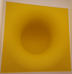
 There was a third type of work in the exhibition: wall installations. They looked like solid vacuums that led into the walls. At first, I was confused as to whether they were paintings or sculpture: I couldn’t get close enough to see. I think they were meant to have that effect: you had to get very, very close to look because of the bright, deceptive colors that were used. For instance, see “Yellow,” illustrated here. Yellow indeed. All of the works on display, in fact, seemed to be playing with the idea of optical illusions, or were themselves about illusions. In any case, I would advise everyone to see the exhibition before it leaves in January.
